What Moves You? A collective realtime mapping of Eindhoven’s Dutch Design Week
During Dutch Design Week 2015 (17th – 25th October), research associate Naomi Bueno de Mesquita at Design Academy Eindhoven (TRADERS researcher in Multiple Performative Mapping), invites you to participate in the cartographic exploration What Moves You? A collective realtime mapping of the transformation of the city during Eindhoven’s Dutch Design Week. DDW’s visitors – YOU! – collectively become the authors/ creators of a map that shows the feelings that circulate during DDW.
HOW IT WORKS
1. Visitors of DDW are asked to use a web-application on their mobile phone (ddw.performativemapping.net) and designate a feeling to a DDW location.
2. A picture is taken of the ‘thing (object, place, person,…) that triggered this emotion.
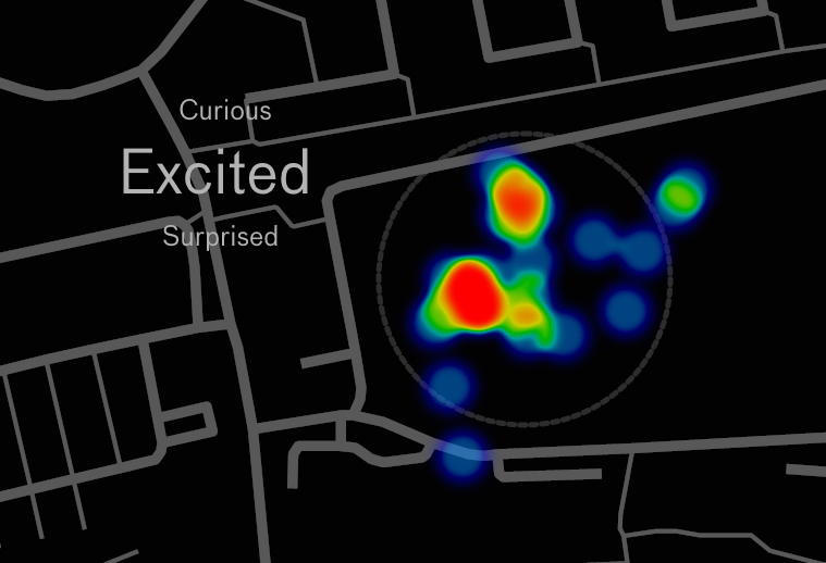
3. The data is uploaded and directly visible. The realtime map demonstrates the areas of Eindhoven (comparing the different venues of DDW) that are more or less emotionally laden, what emotions are felt where, and why. For example, many pictures of the same object tell us that the work in question triggers an emotion that is felt collectively, but in case a work has many different adjectives linked to it, it tells us that people experience different emotions that are all triggered by the same work.
HOW IT IS PRESENTED
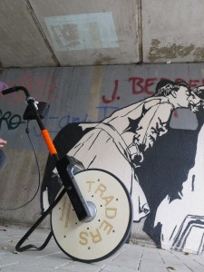
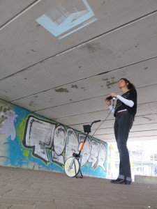
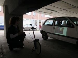
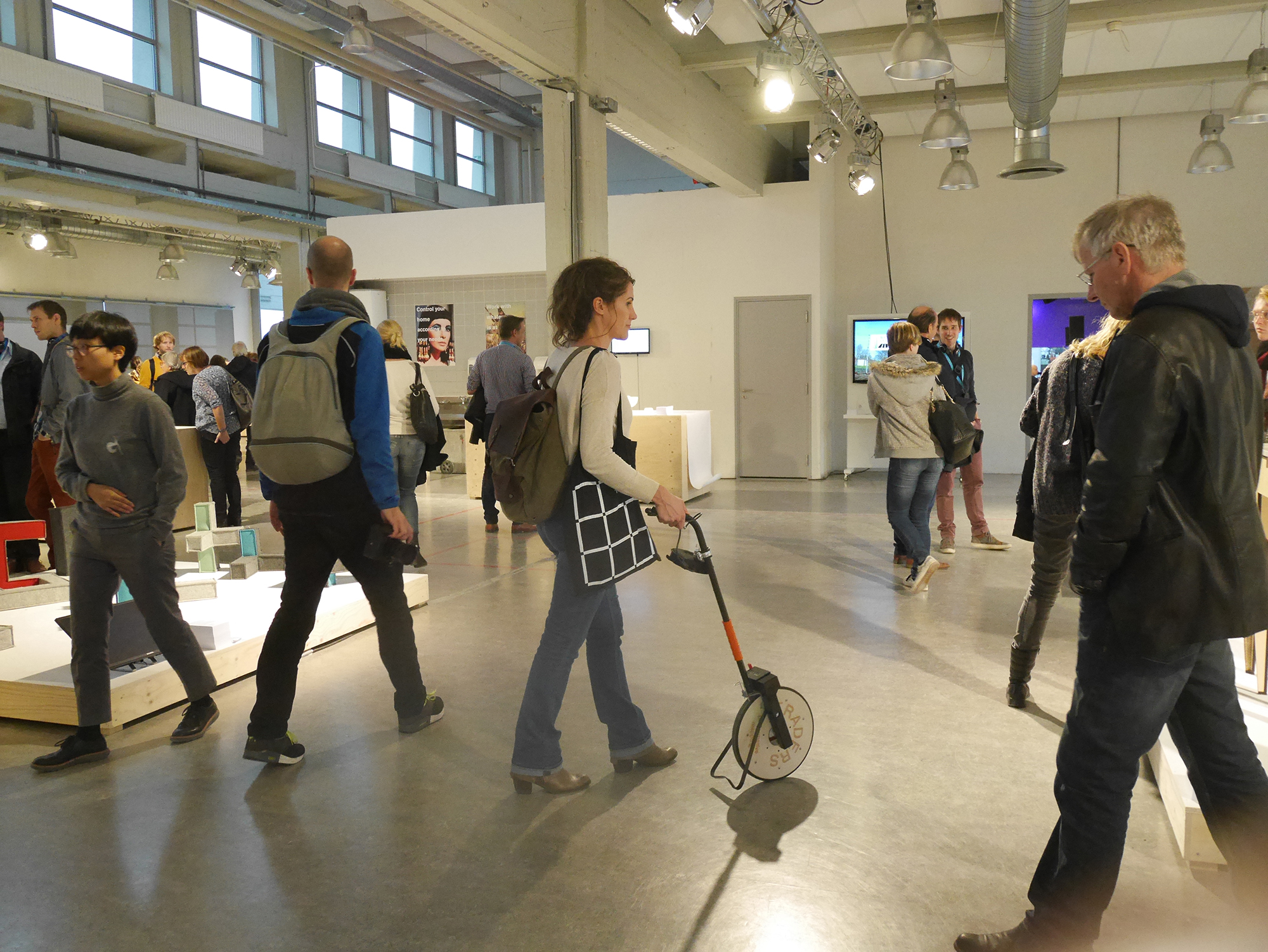
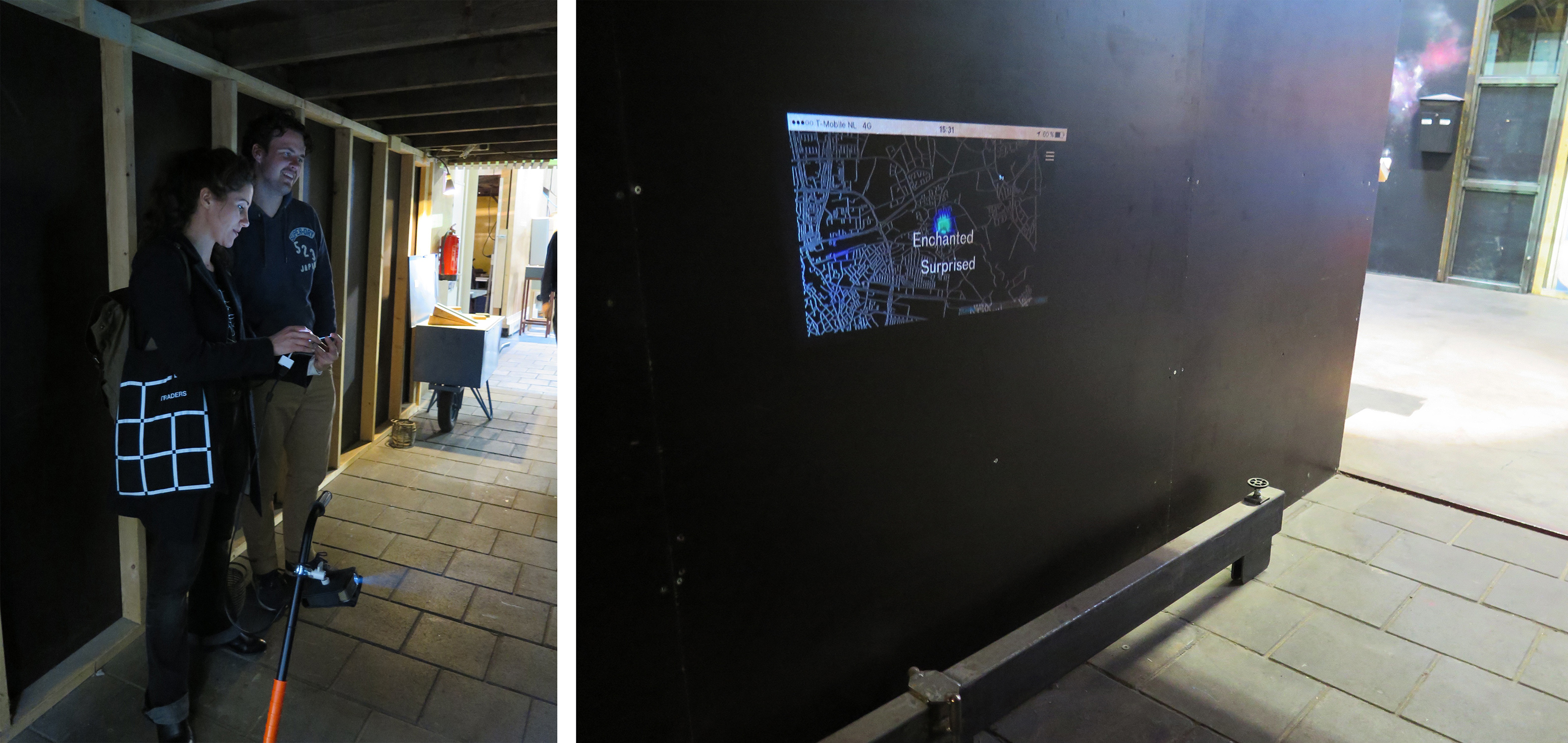
During Dutch Design Week Naomi walked in Eindhoven between the different venues with a measuring wheel on which a projector is mounted, this way; doubling as presentation device. The measuring wheel is to be seen as a metaphor for the way in which Naomi measured and (asked visitors to) map(ped) feelings that circulate during Dutch Design Week. The object is designed by Karianne Rygh and Rinze Borm. It makes the digital component of this research tangible and part of a performance in which visitors of DDW are triggered to participate. Throughout the week, the realtime map was projected on the urban fabric in different places in the city. Naomi carried a device which tracked her movement so that people could find her anytime of the week if they wanted to ask her for an update of the map or to discuss the research.
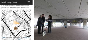
Naomi carries a tracking device with her with which the walked tracks can be followed via a website. Visitors can visit her anywhere to get an update on the map or to discuss the research (such as here under the bridge).
CONCLUSION
Regarding participation:
A total of about 100 people (116 entries) participated in the mapping. Sectie-C was the first venue to put itself on the map and it stayed the most participatory venue when it comes to mapping emotions. In the centre very little participation was to be found in the beginning of the week, but this changed halfway the week as Design Academy Eindhoven placed itself prominently on the map as most emotionally laden venue on the fourth day of the event. The different venues at Strijp S participated throughout the whole week but with fewer people.
I made an attempt to visit the different venues every day for an equal amount of time and divide the flyers and posters equally among the different venues, with the aim to avoid a bias (one venue participating more than the other because of my presence). In general were visitors of Sectie C more inclined to participate in the collective mapping. This was not only backed up by the number of participants throughout the whole week, but also by the reactions that I received on the presentations of the map. Several designers who have their studio space there were curious to know how their works were perceived by visitors and they were even willing to ask people to participate. This interest was not expressed as much by employers or graduate students of Design Academy Eindhoven. The most common arguments that were given for not wanting to participate: The digital is not my ‘thing’, I don’t have/ use internet on my phone, I don’t want to use my own phone. In the last two cases I gave people that were interested to participate a phone to borrow. On the measuring wheel, however, I received a lot of reactions from the design public. People were curious to know what I was measuring and wanted to know more about the design of the object.
Having tried similar experiments with other participants and at different events (undocumented citizens of Amsterdam, university scholars from Utrecht and scenographers at the Prague Quadrennial of Performance Design and Space) I found that, in general, the design public at Design Academy Eindhoven is less inclined to participate. This might be due to a number of people without internet on their phone, but I believe it also has to do with the approach that Design Academy Eindhoven has chosen to put forward in this year’s show. In Thomas Widdershoven’s words “this year’s graduation show is about tactility as reaction to the complex and abstract technological advances”. In my opinion it is a bigger challenge for designers to engage critically with the technological advances instead of reacting against it. Just like other societal issues that were addressed in this year’s graduation show, it would have been interesting to address the digital interface or the digital divide from a design research perspective. I see a big challenge here for designers.This opinion is not shared with most people that I talked to at Design Academy Eindhoven and I didn’t receive good arguments, so far, as to why this is not given more emphasis at this academy. Not engaging with it critically will result in a more consumeristic attitude towards these technologies (which is already noticeable) by using the technology instead of questioning it or engaging in the debate/ construction of its future course.
Regarding results:
People were able to choose between the following emotions: Alienated, Annoyed, Anxious, Bored, Confused, Curious,
Disgusted, Dissapointed, Embarrassed, Enchanted, Excited, Frustrated,
Moved, Overwhelmed, Surprised.
These emotions (the legend of the map) came about in the following way: A couple of weeks prior to the mapping I asked several people to give me a list of emotions (adjectives) that they felt during previous visits to DDW or another art or design event. Out of these I selected the most chosen words. This way, the legend was not ‘made up’ by me and I assured to have the six basic emotions that are used in psychology in the list. The most frequently chosen emotion of all the venues was Curious, followed by Excited, followed by Moved, followed by Enchanted, followed by Surprised, followed by Overwhelmed, followed by Alienated, followed by Confused and Frustrated.
Here follows a summery of the emotions (with a minimum of two entries) that were chosen by the visitors at the different venues:
Design Academy Eindhoven
Curious (14 entries, with all different pictures/ associations to this word)
Moved (7 entries, with 2 people having chosen the same object)
Overwhelmed (4 entries, with 2 people having taken a similar picture of the crowd)
Excited (3 entires)
Surprised (2 entries)
Frustrated (2 entries)
Anxious (2 entries)

Sectie C
Excited (7 entries, of which 3 participants chose the same work)
Curious (3 entries)
Surprised (3 entries)
Moved (3 entries)
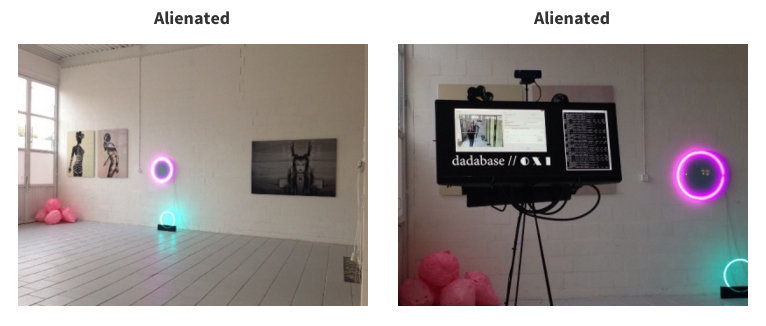
Alienated (2 entries, both participants chose the same work)
Overwhelmed (2 entries, both participants chose the same work)
Confused (2 entries)
Strijp S:
Excited (7 entries, with 2 people having chosen the same work)
Enchanted (4 entries)
Moved (2 entries)
Other emotions that had only 1 or 2 entries were Bored, Annoyed, Confused, Curious and Surprised.
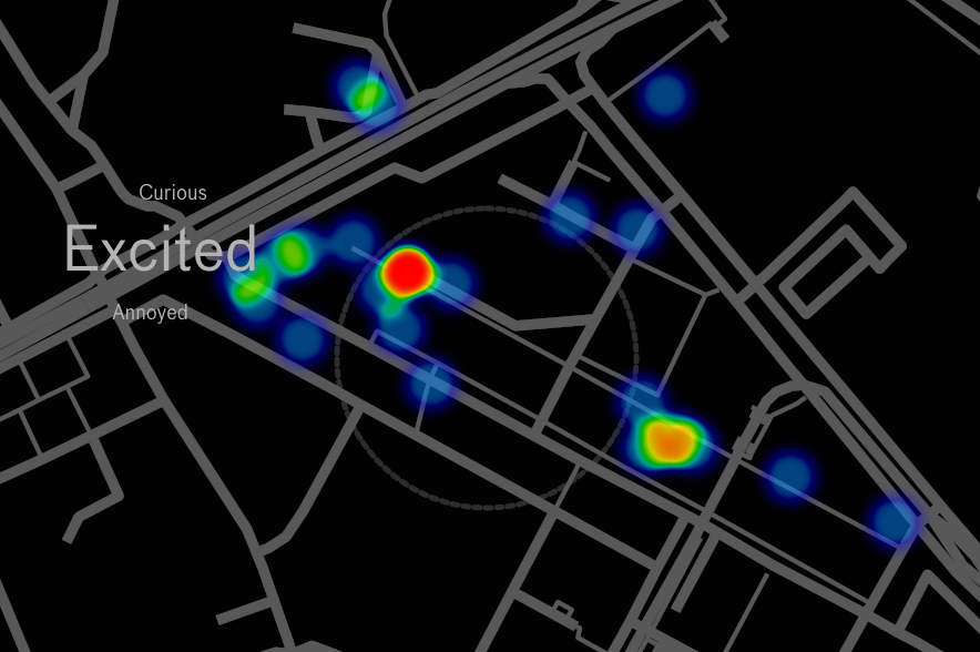
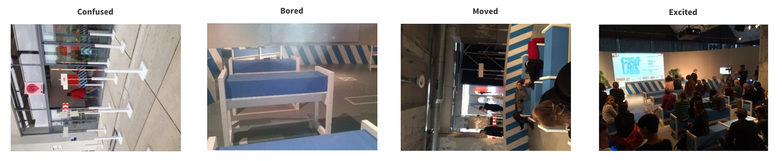
It is interesting to notice that the installation at MU art centre is experienced most diversely. The installation was subscribed as exciting, moving, confusing and boring.
The map, the pictures and an animation of the map (showing the map as it evolves in time) can be viewed on this website: ddw.performativemapping.net.
The pictures below were taken on the fourth and fifth day of Dutch Design Week while I presented the maps to the public. Photographed by Karianne Rygh and Elise Weegels.
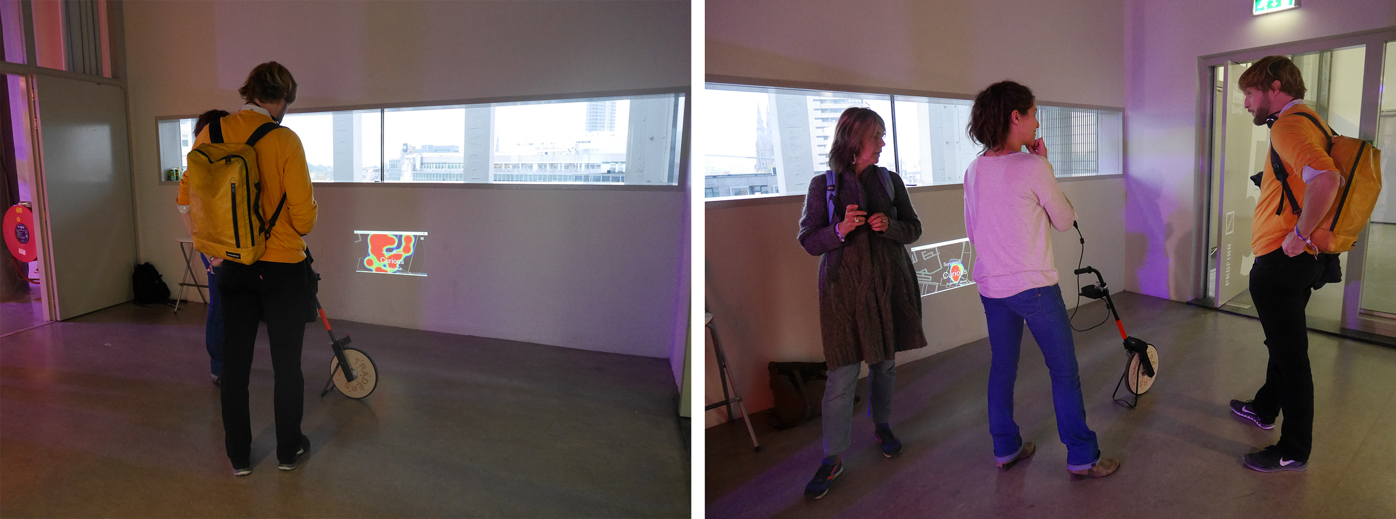
The man has his studio space here and was interested to find out what visitor’s feelings were regarding his works. The map is of the 4th day of Dutch Design Week. Sectie C is, so far, the most emotionally laden venue of DDW
CREDITS
Programming of web-application by Iván Fuciños Calle
Design of flyer by Niek Kosten
Design of measuring wheel by Karianne Rygh and Rinze Borm
Photos by Karianne Rygh and Elise Weegels